Visual Identity & Brand Strategy
Agency: Frankly, Creative Agency
Client: SaskEnergy
The Strategy: Co-Creation & Connection
Working in close collaboration with Indigenous advisors, artists, and community representatives, my team architected a brand system centred on the interconnection between people, the land, and the essential energy that sustains life. This project required a deep "strategy-first" approach, building a communications framework rooted in shared values and respect.
Integrating Culture Into Design
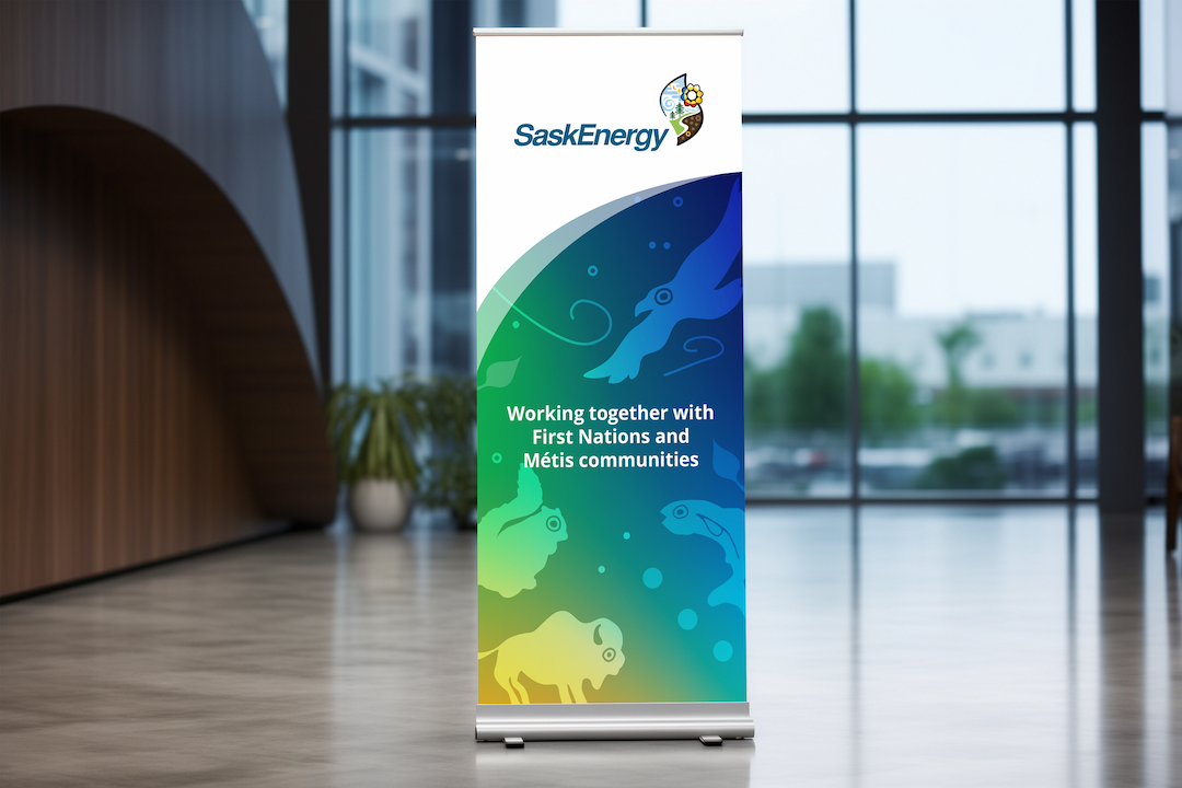
As the Art Director, I worked closely with Indigenous designer Tim Neal, to create a visual brand system and identity unique to SaskEnergy. Using Tim’s illustrated graphics and logo, we authored a brand story centered on the theme of interconnection, aligning SaskEnergy’s services with the natural elements of earth, air, fire, and water.
Implementation Framework:
Our team built high-fidelity "brand-in-action" assets, including social media templates, digital components, and event materials to guide internal and external teams.
Inclusive Brand Guidelines
We then worked on an established usage standard to ensure cultural integrity, accessibility, and consistency across digital, print, and social media platforms.
Impact & Results
This sub-brand has become a permanent pillar of SaskEnergy’s corporate identity, utilized across community programs and national sponsorship initiatives. The project successfully:
Strengthened trust and representation within Indigenous communities
Established a new benchmark for respectful brand inclusion and cultural authenticity in the public sector.
Demonstrated the power of "Strategic Craft," proving that complex social goals can be achieved through high-fidelity, thoughtful design.