

SULU
Client: SULU Restaurant
Good Food. Good Energy.
Scope: Brand system, cultural storytelling, web design & UX
Live site: suluyxe.ca
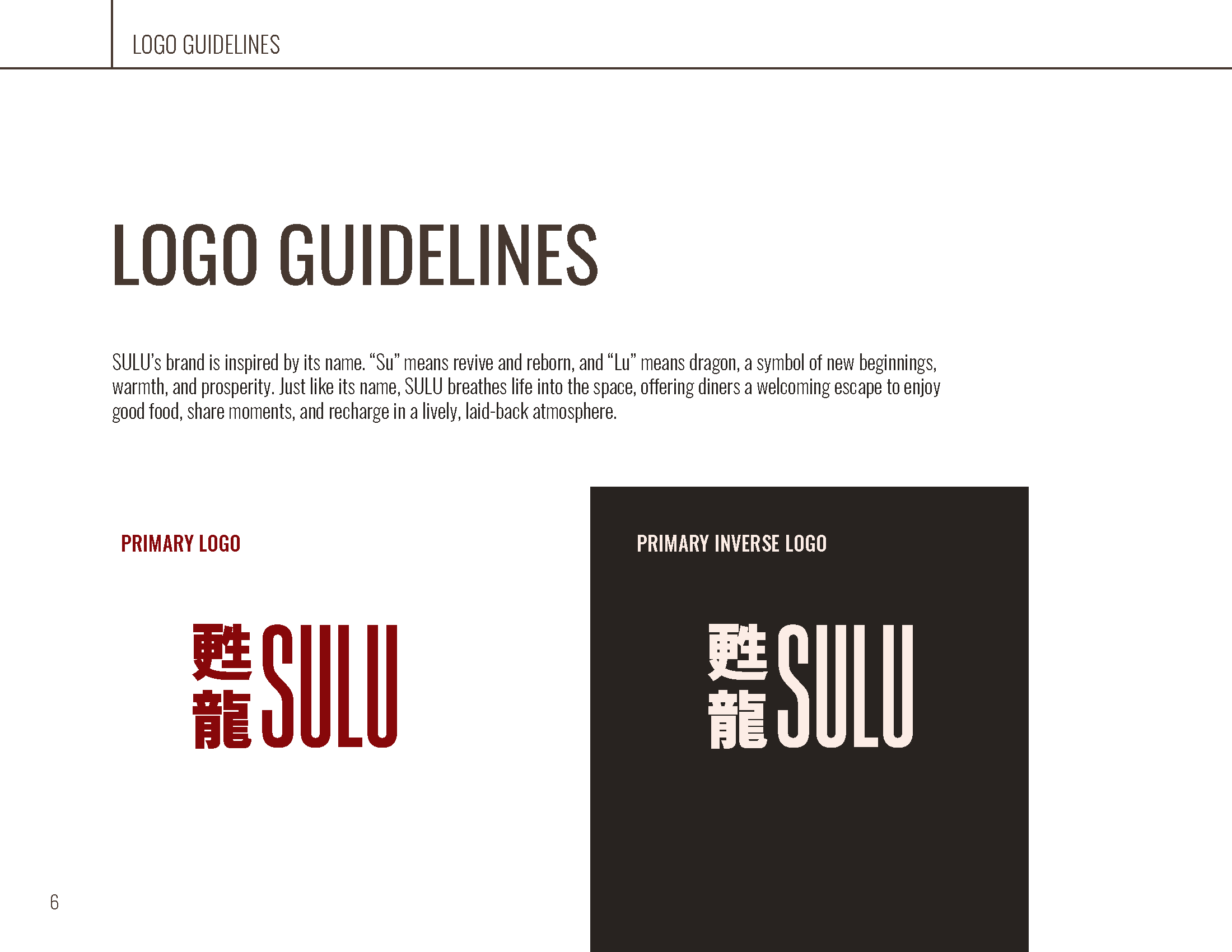
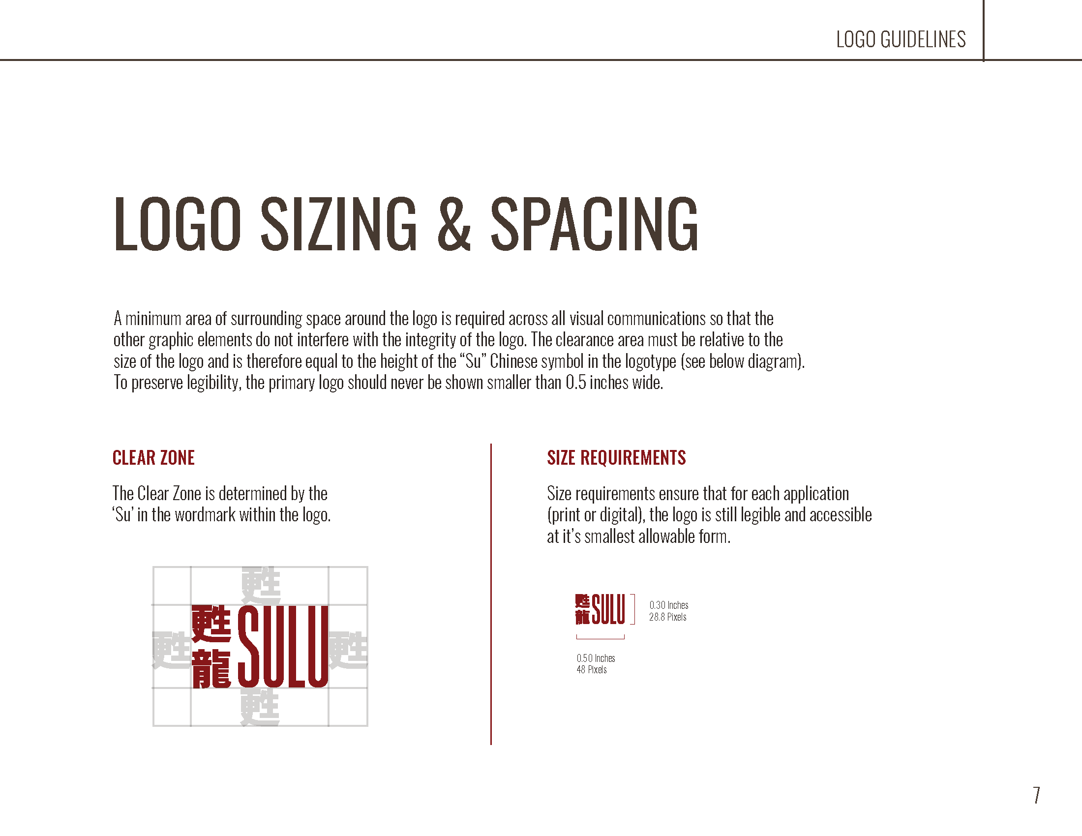
Founder Andy approached the project with a vision to bring heart back into downtown Saskatoon’s dining scene by catering to a vibrant late-night crowd. With an existing logo already in hand, the challenge was to expand this single mark into a complete, cohesive brand identity and web experience that sits at the intersection of modern design and authentic Chinese tradition.
Brand Strategy & Positioning:
Cultural Harmony: Designed a custom visual language rooted in Chinese symbolism. Animal pairings were selected with strict adherence to traditional folklore rules. For example, avoiding conflicting pairings like the Dragon and Rabbit.
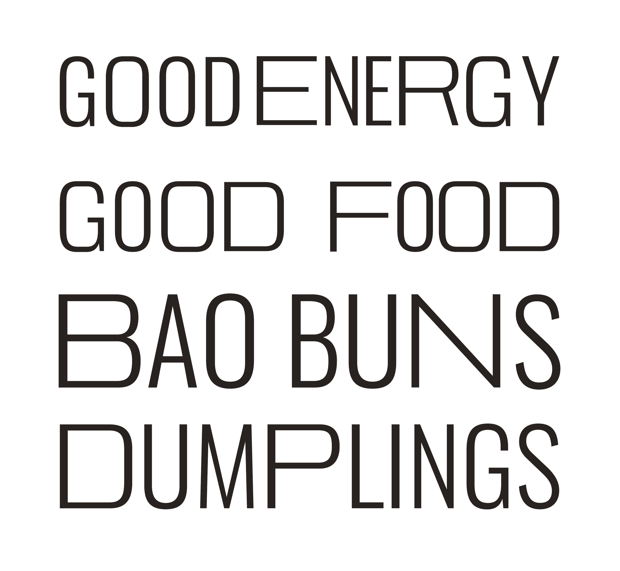
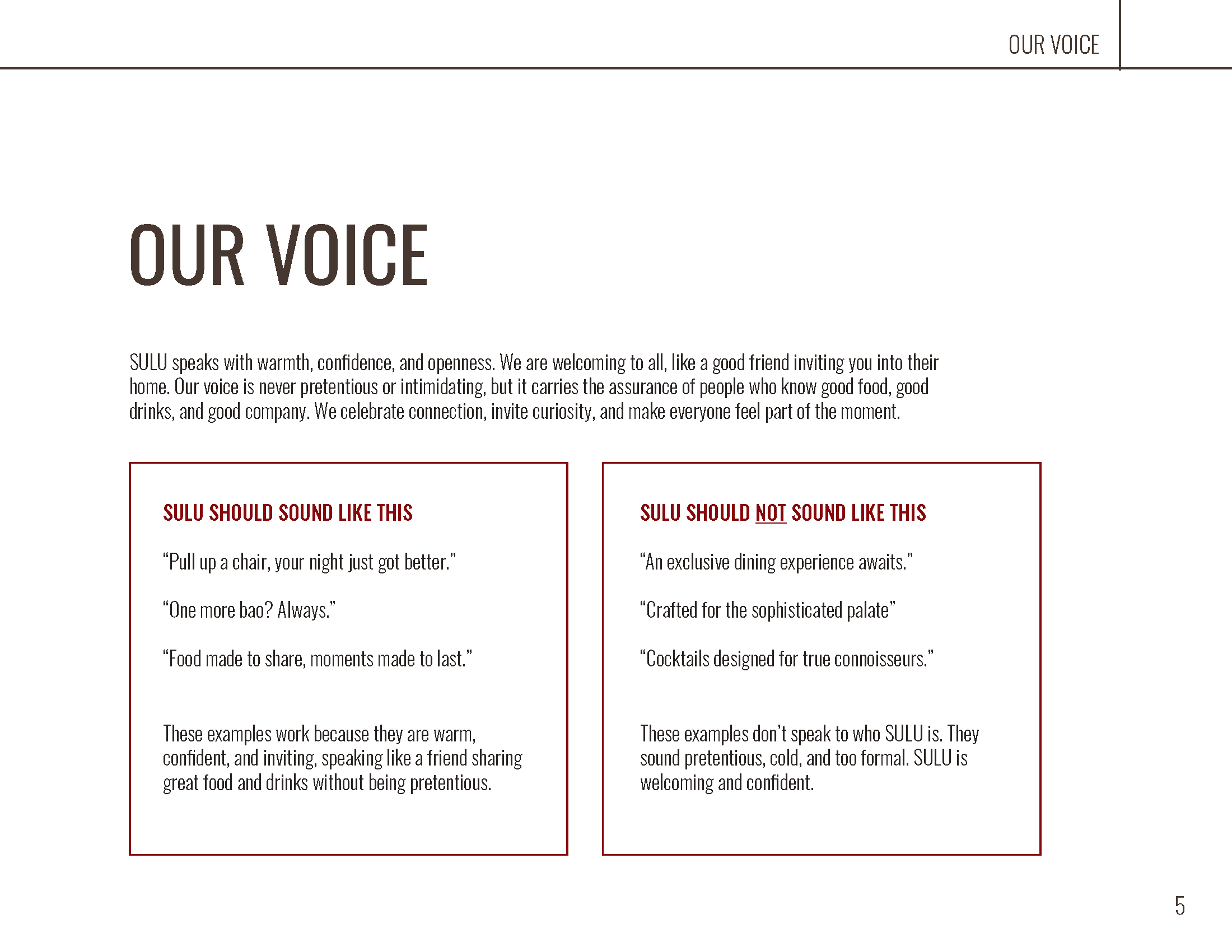
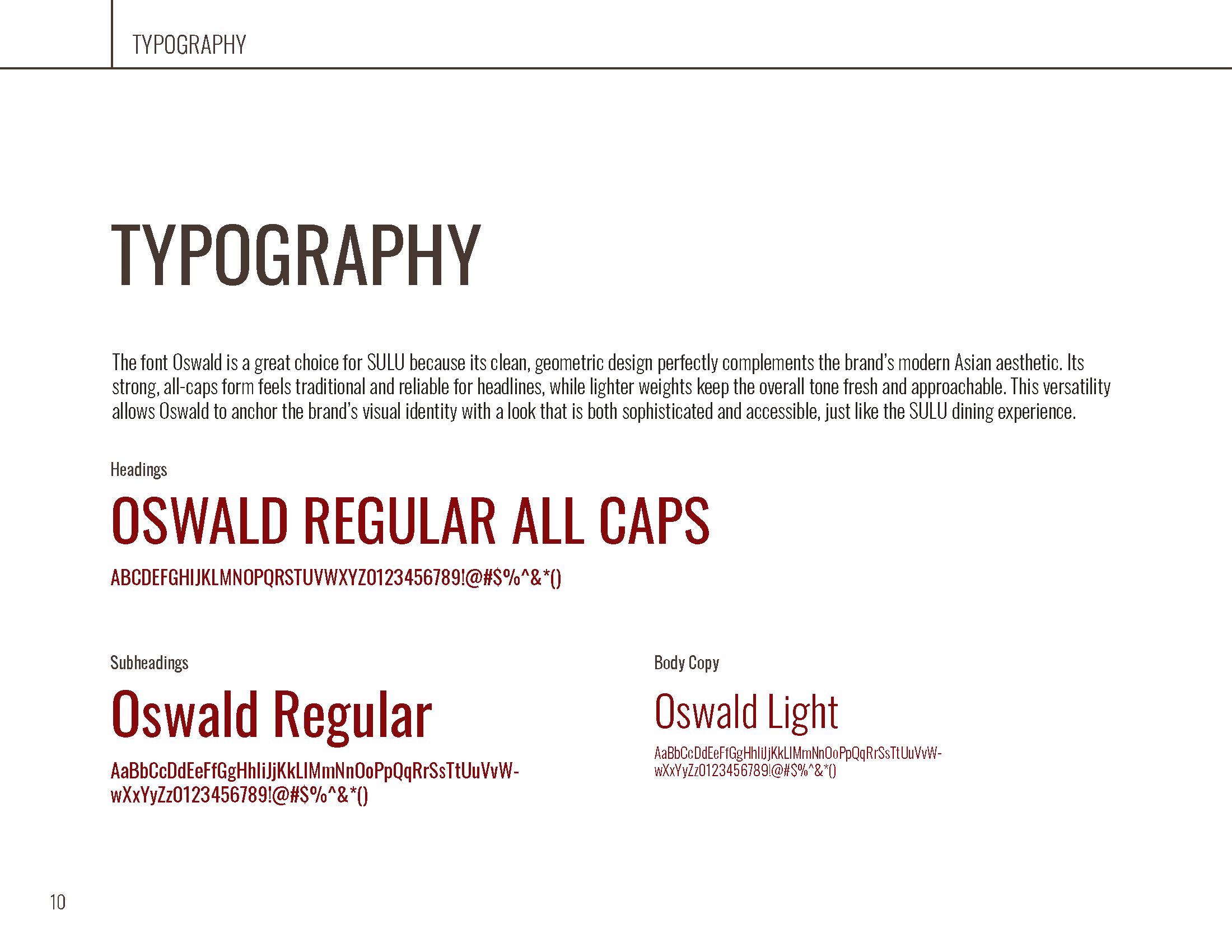
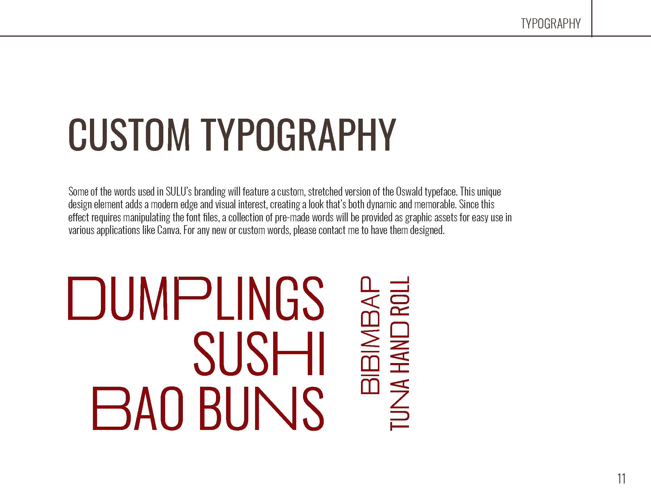
Typographic Narrative: The brand typography was chosen to reflect warmth and hospitality; inspired by full bellies, robust table conversations, and long nights spent sharing food.
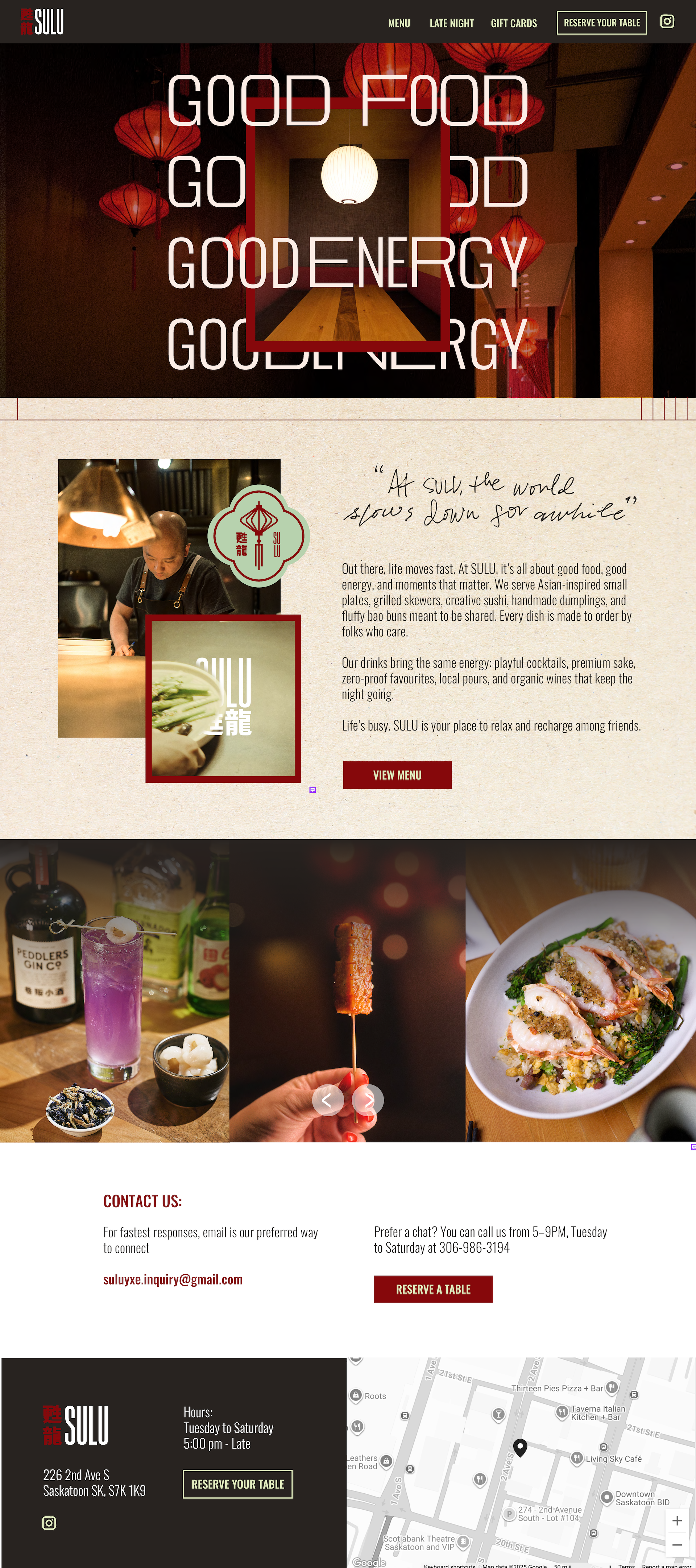
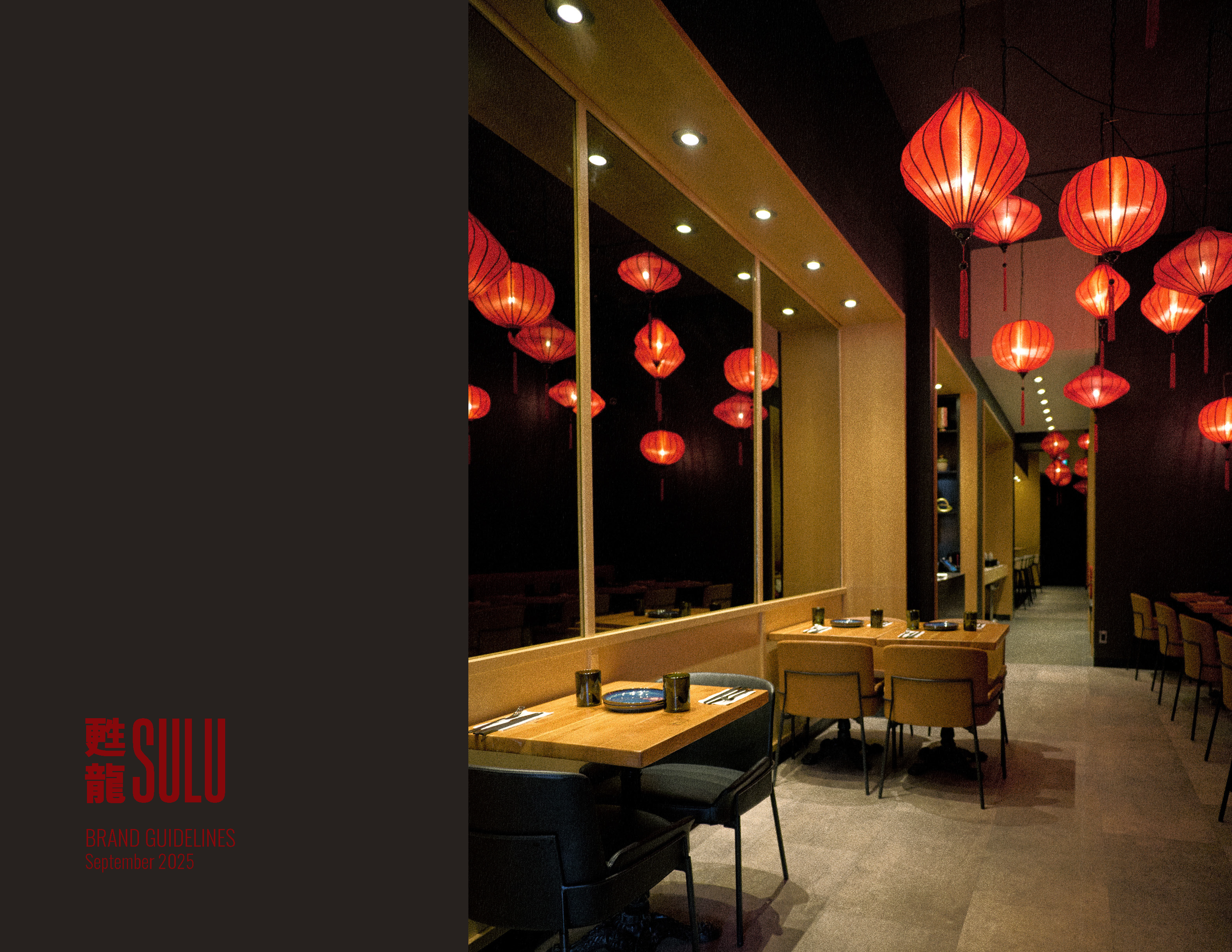
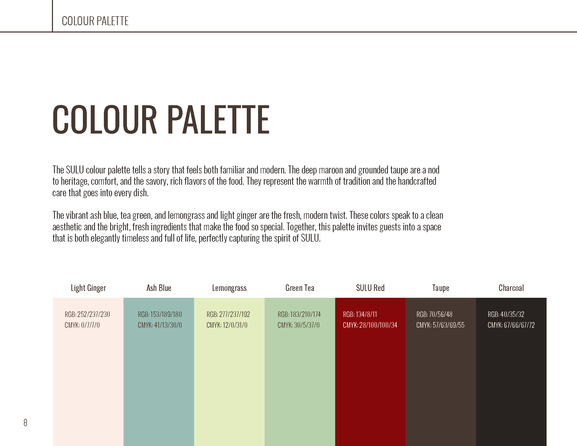
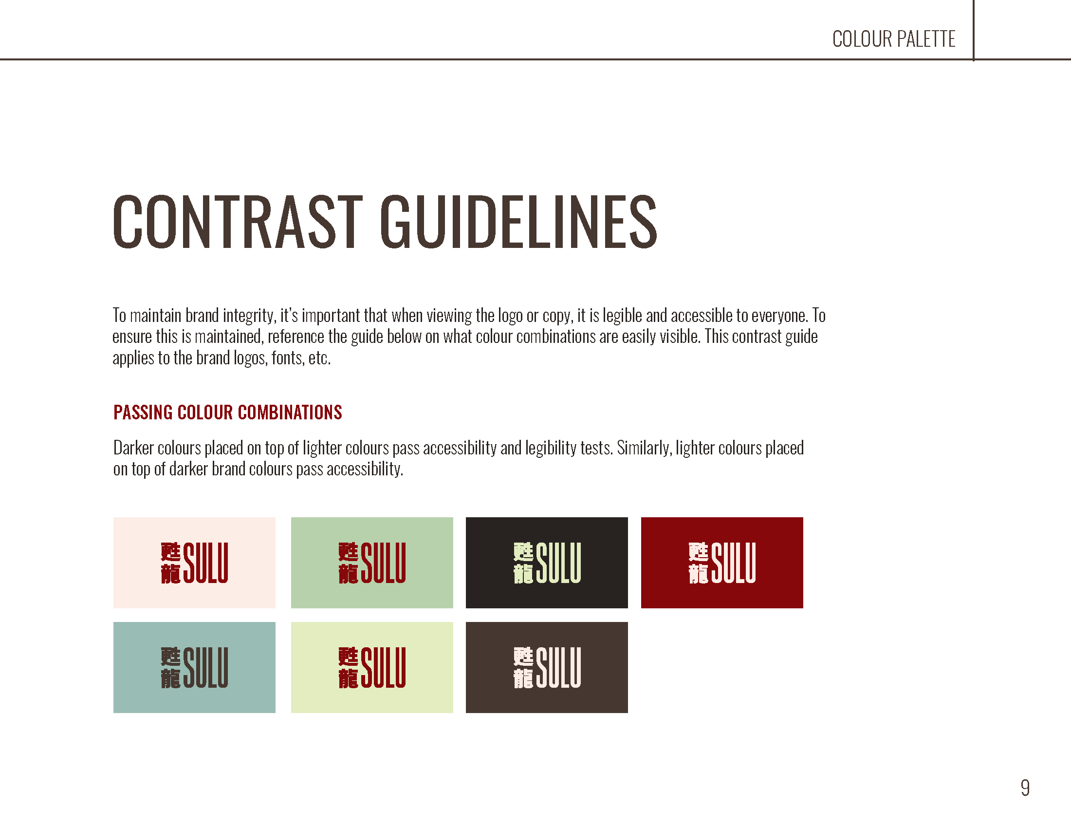
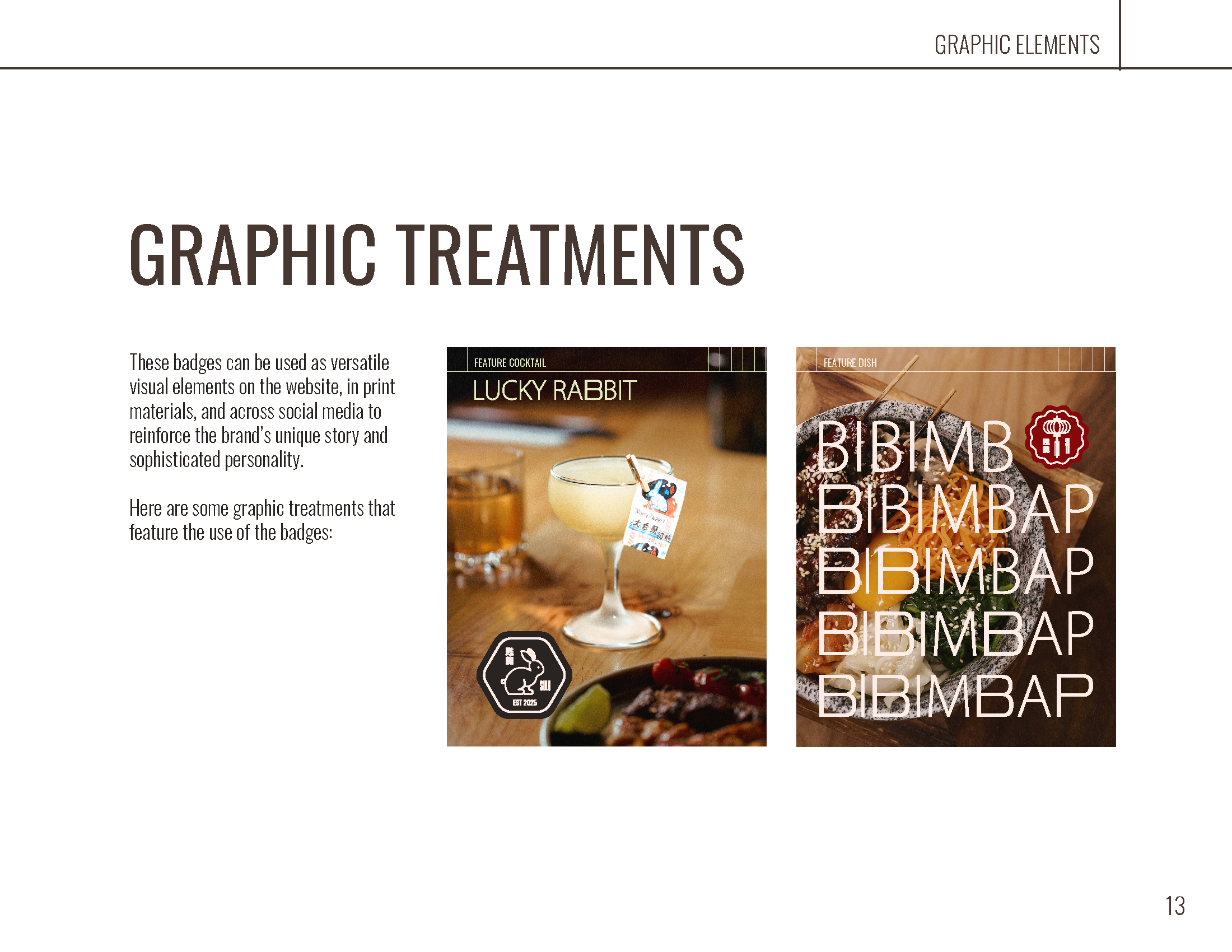
Visual Identity: Balanced a glowing, late-night downtown mood with crisp modern aesthetics and custom brand badges.
The Outcome:
Transformed a standalone logo into a distinct, culturally resonant brand system. SULU stands out in downtown Saskatoon as a go-to late-night destination where modern design meets deep tradition and good energy.
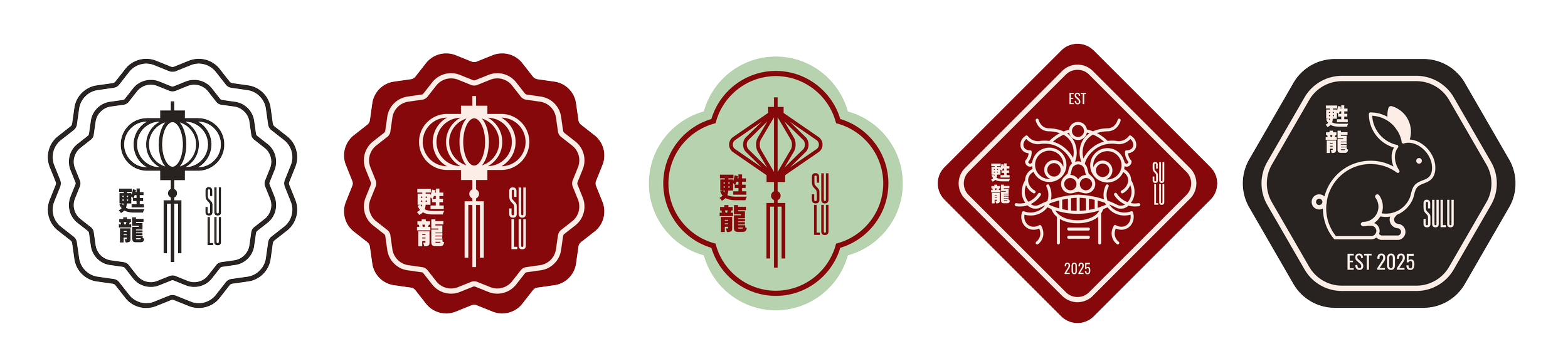
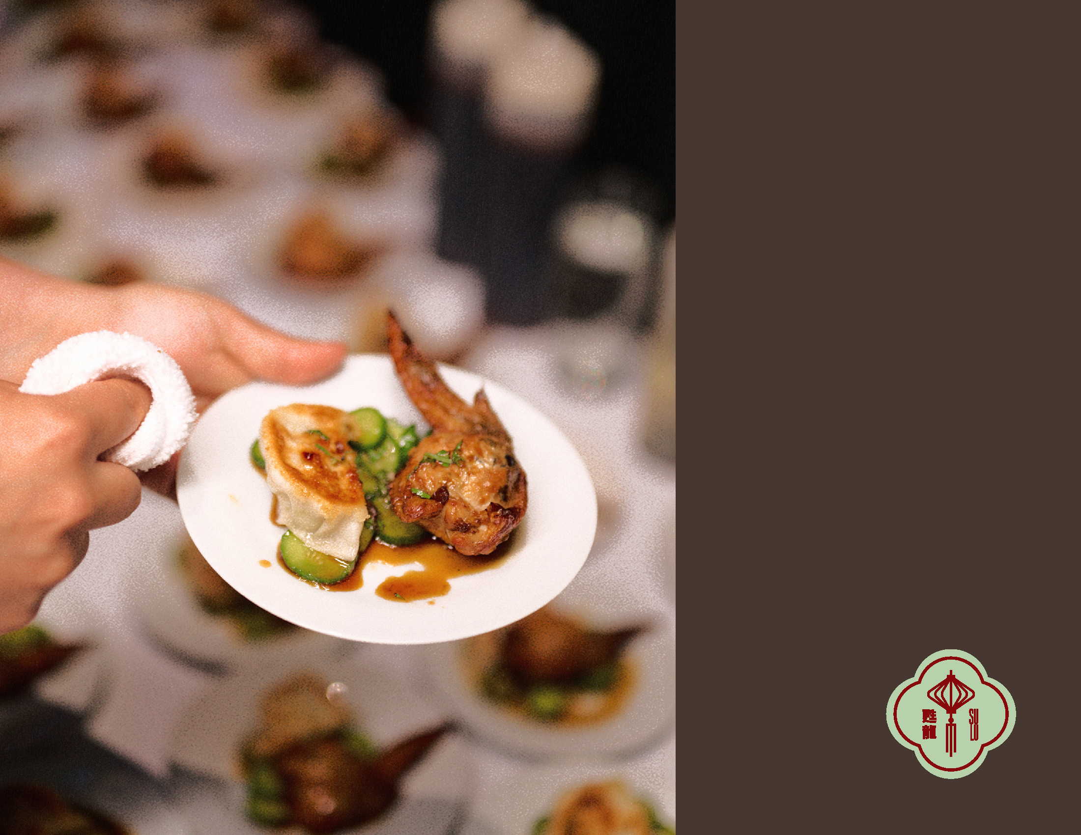
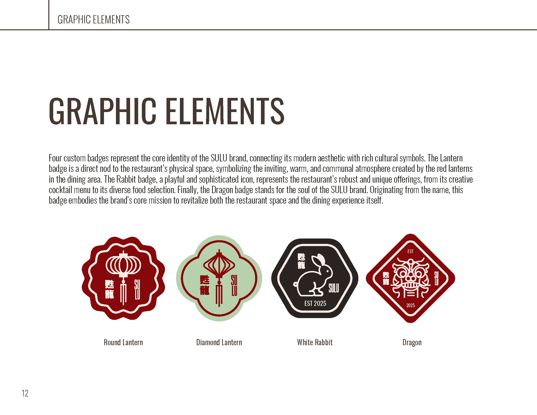
Custom set of traditional badges for use across all branding applications.
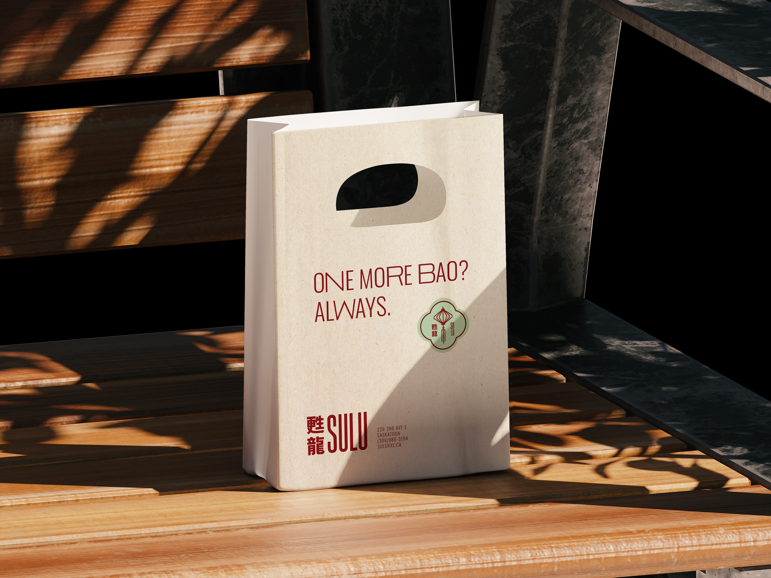
Take out tote design.
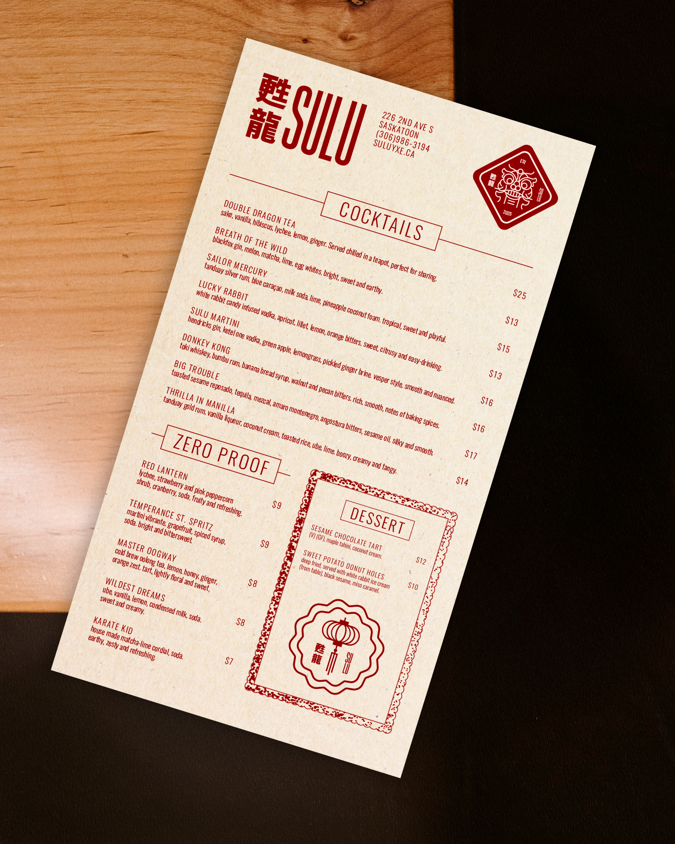
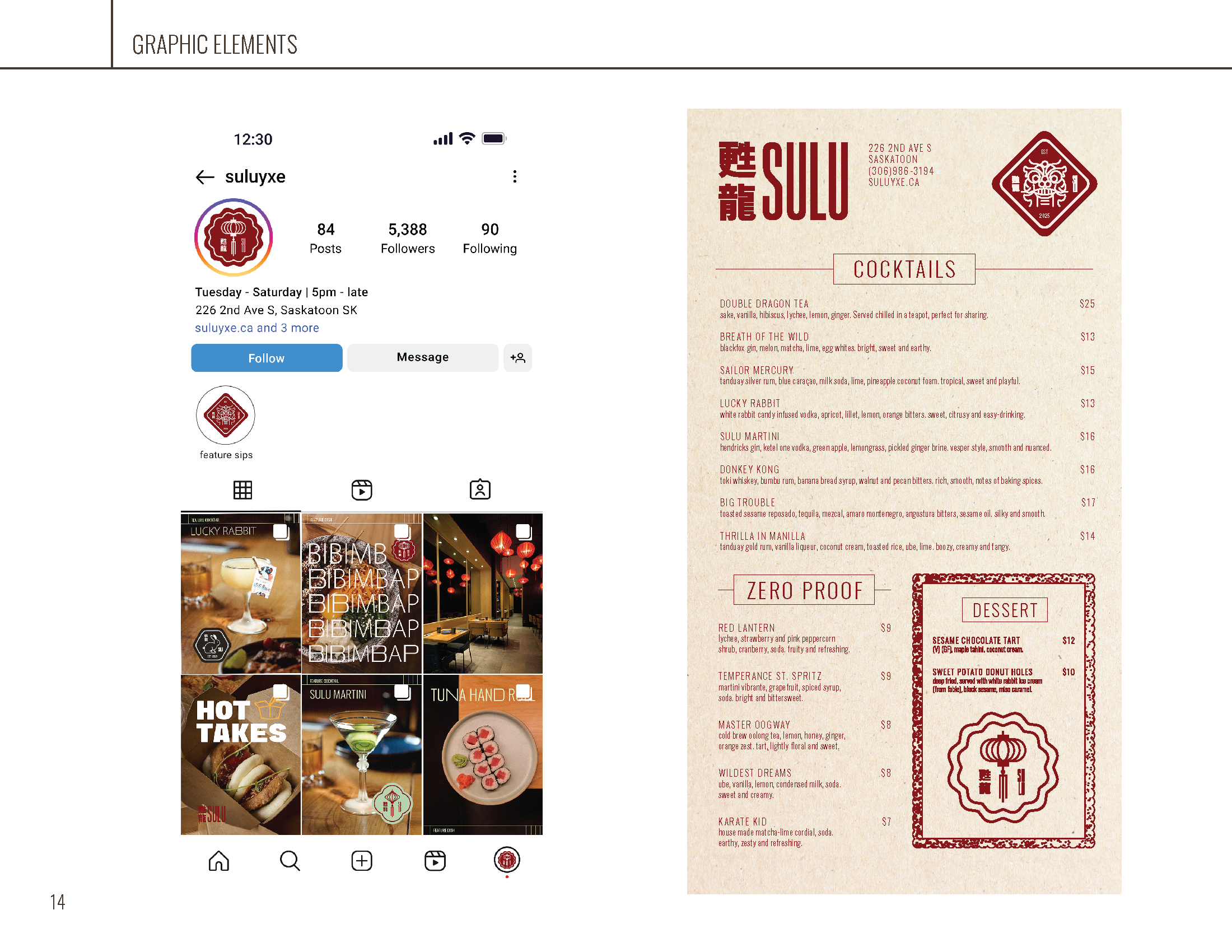
Menu design.