High Key
Brewing Co. Refresher Line
Agency: Frankly, Agency
The Opportunity:
Hard beverages often split between artificial party drinks or muted, clinical seltzers. High Key needed a middle ground: a botanical-led refresher elevated enough for wellness-minded drinkers, while keeping the bold personality of a craft brewery.
Expanding the High Key Brand:
High Key expanded beyond craft beer into wellness with a line of lighter, botanical refreshers aimed at health-conscious folks in their 20s to 40s. Built around a "pick your own bouquet" four-pack concept, the line effortlessly bridges craft brewing with modern wellness culture.
Ingredients as Identity:
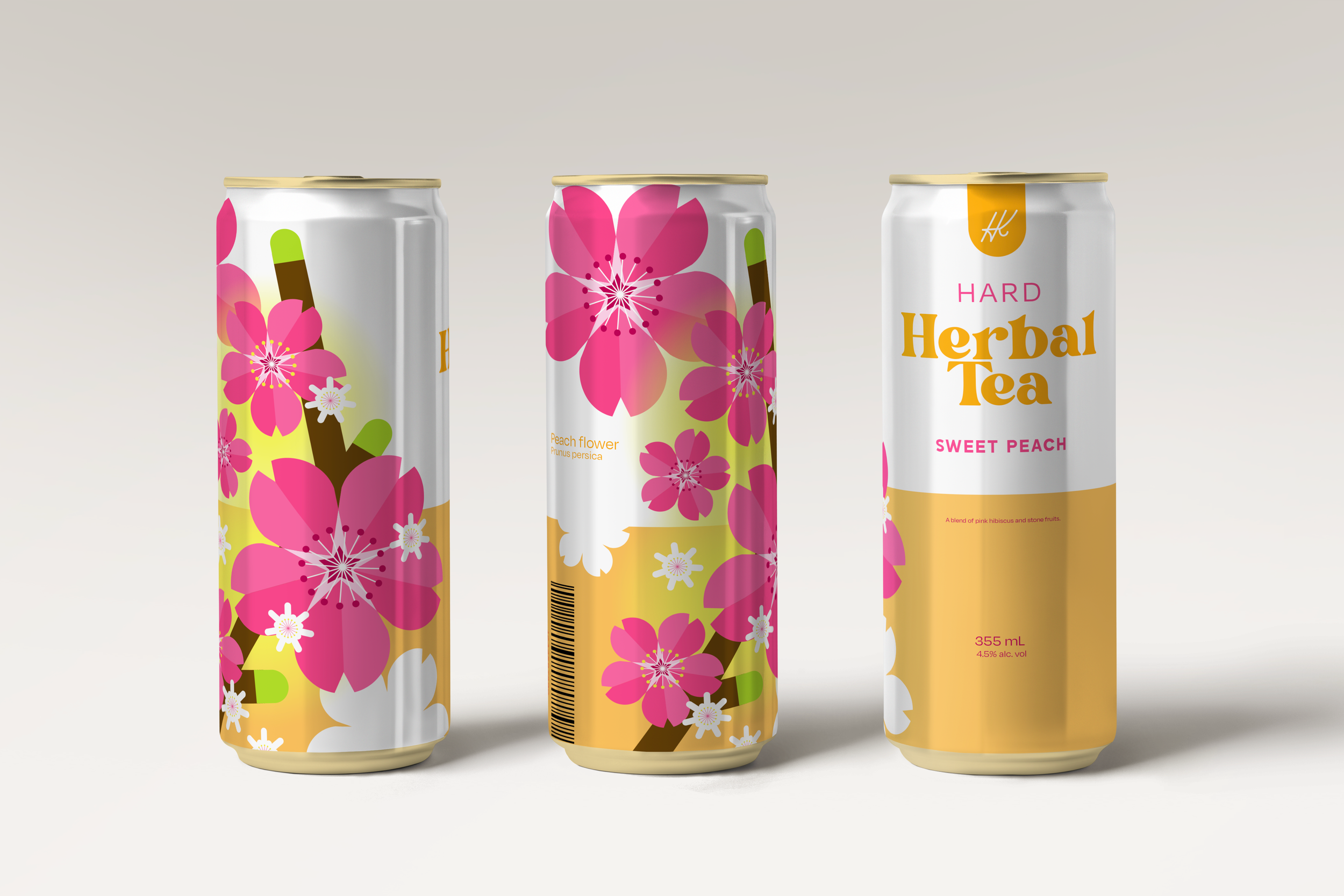
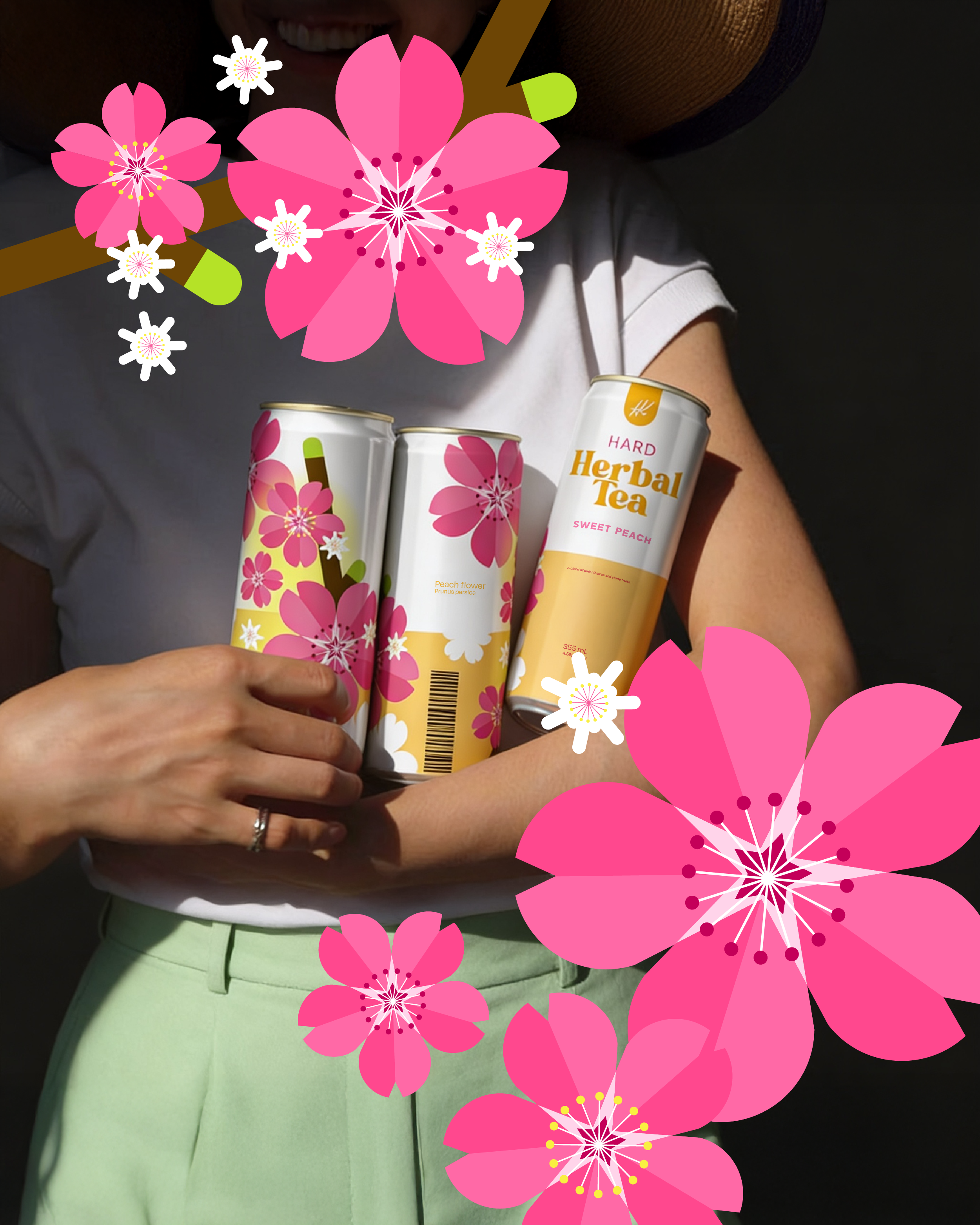
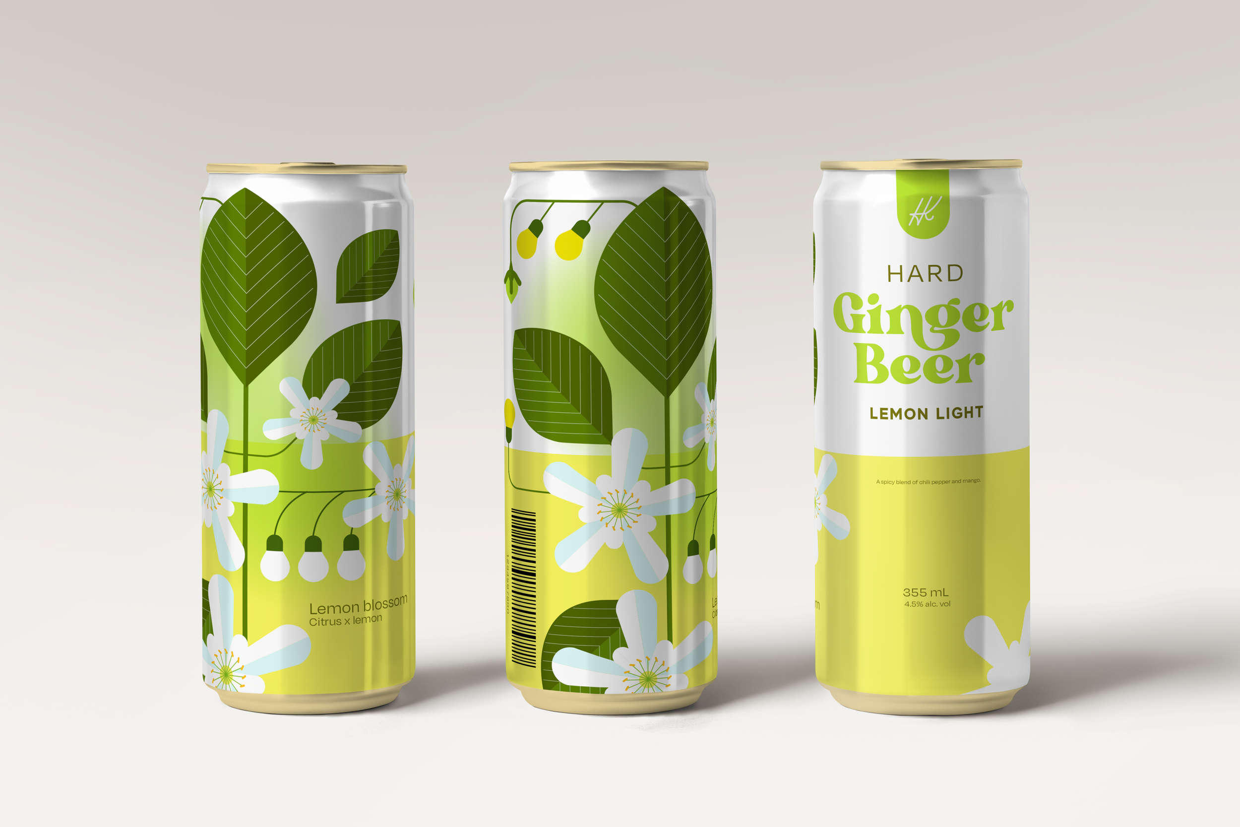
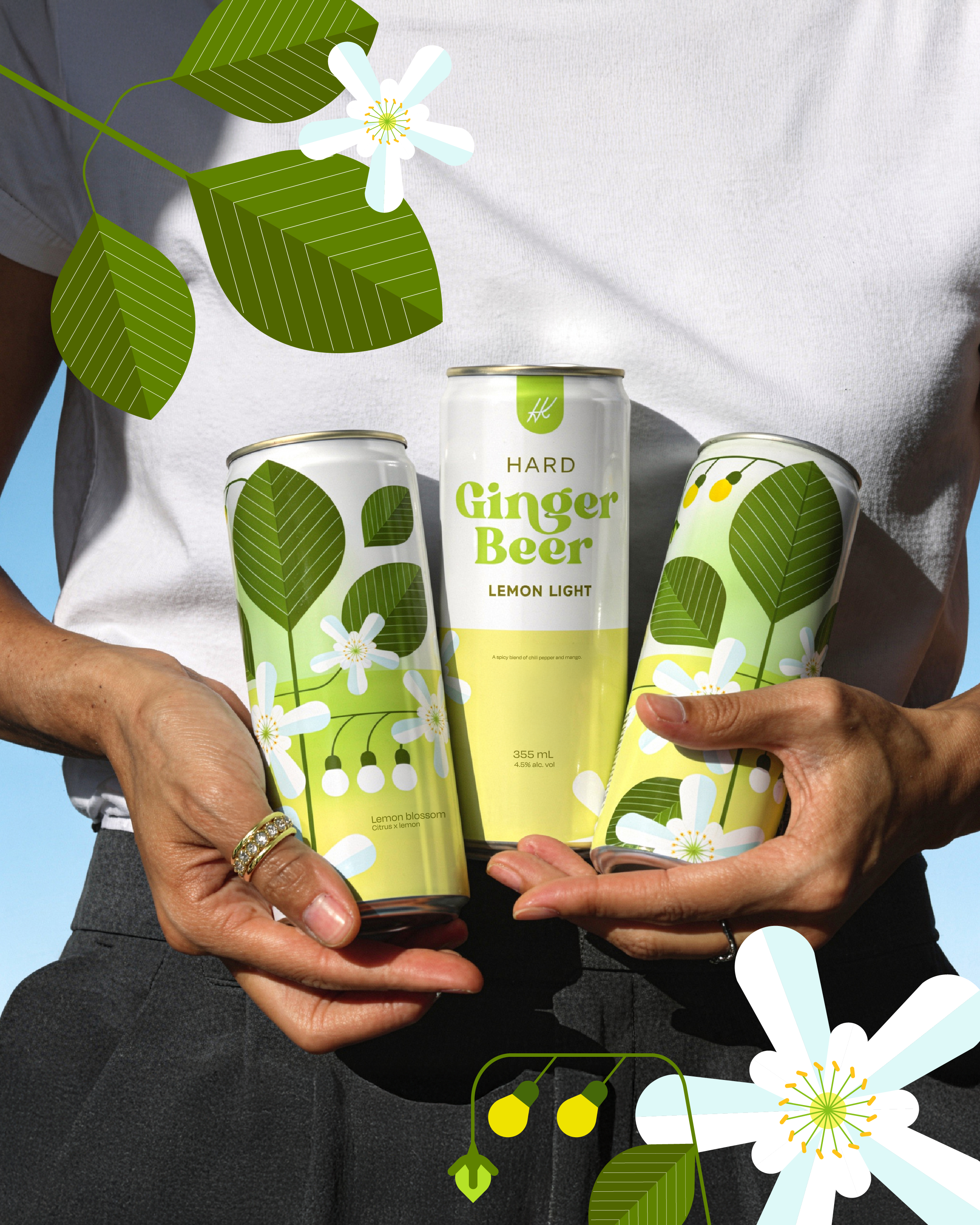
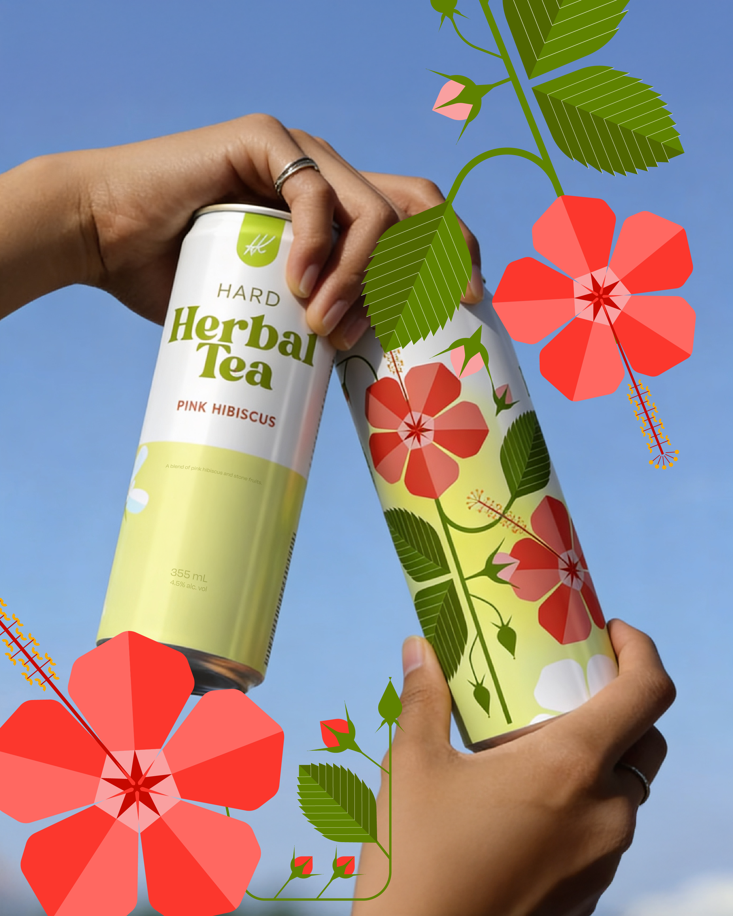
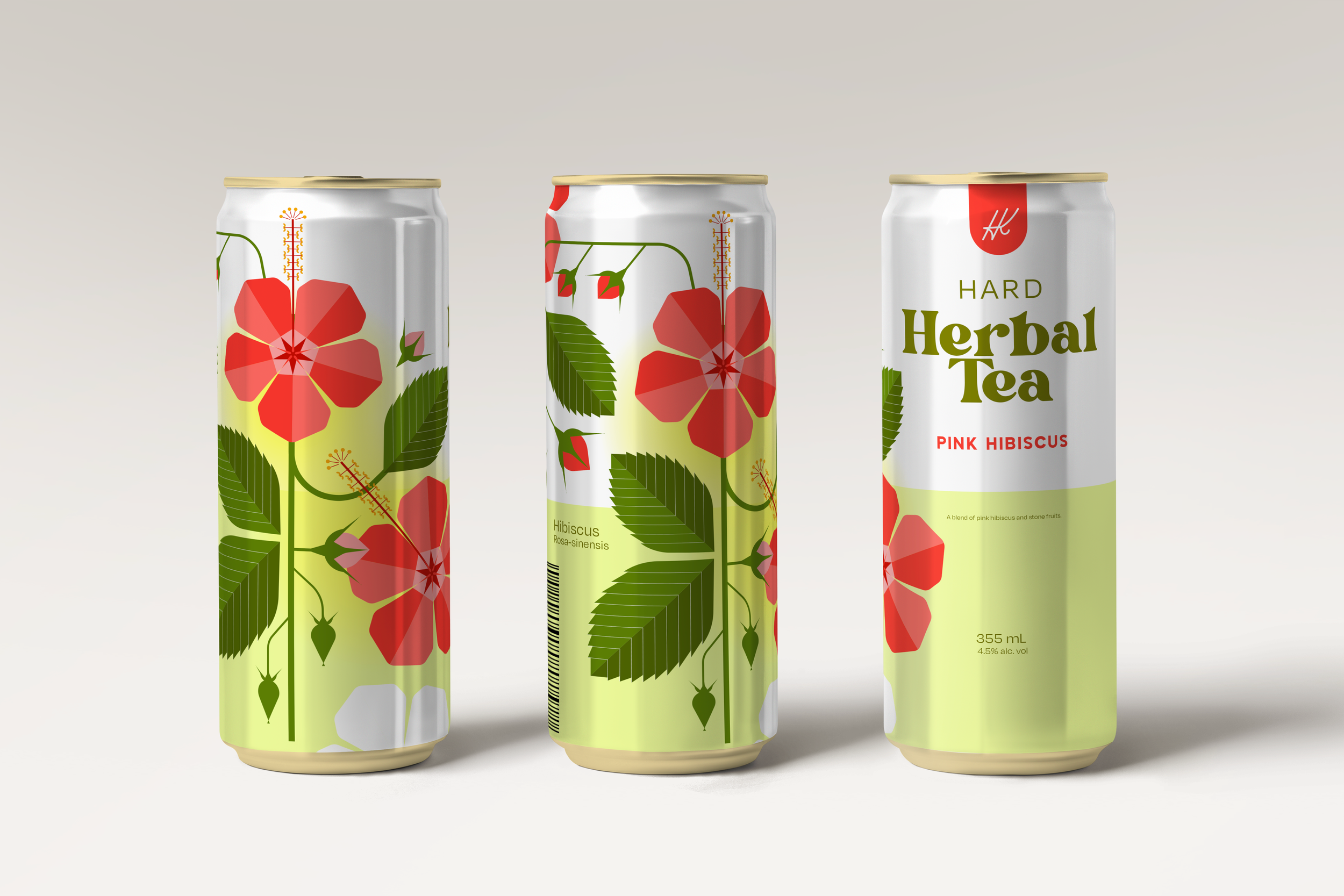
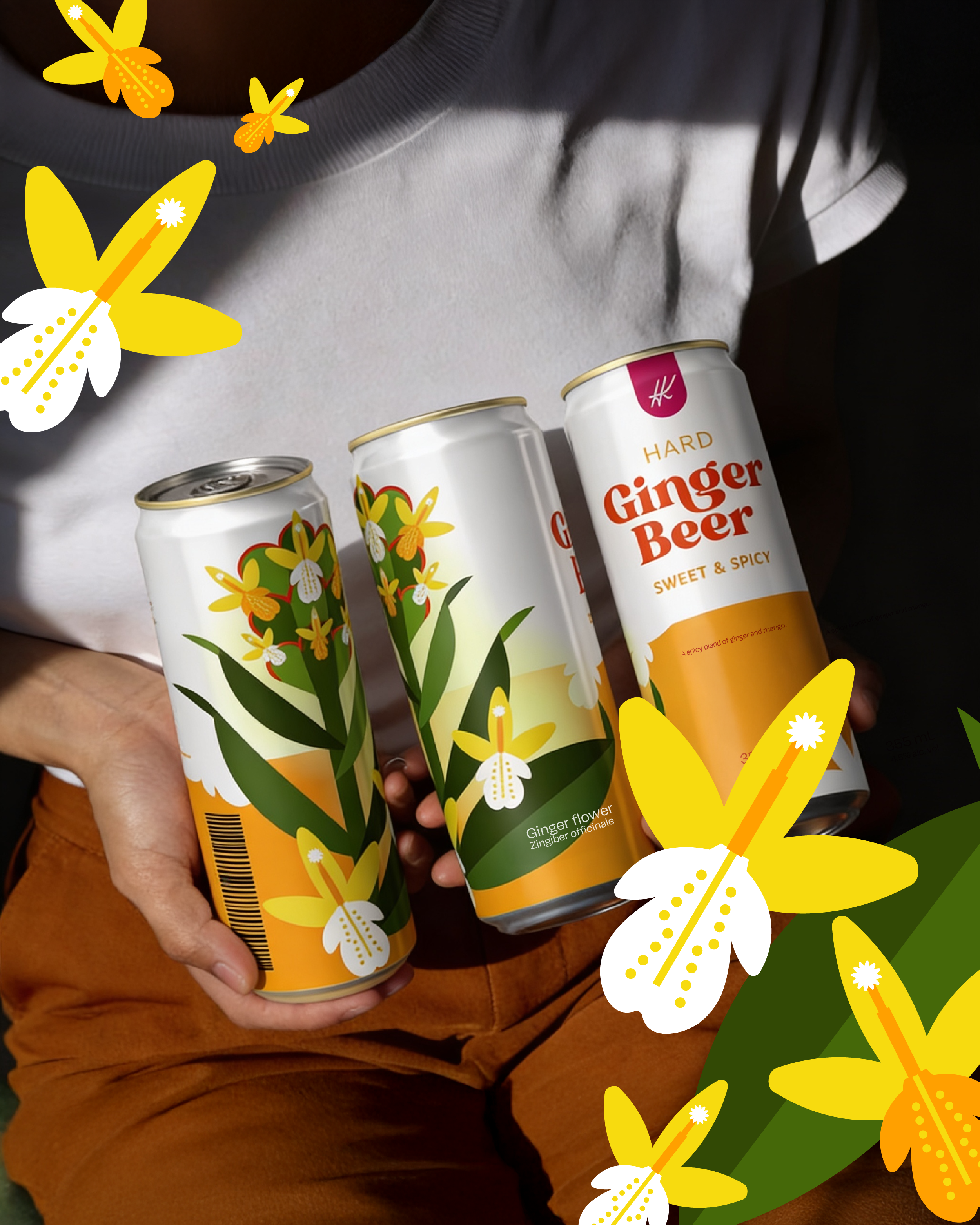
We turned the natural ingredients directly into the brand identity. Each flavour- Pink Hibiscus, Sweet Peach, Ginger Flower, and Lemon Blossom- is represented by a geometric interpretation of its actual flower.
Botanicals distilled down to pure shape and colour: distinct on their own, better together, and unmissable on the shelf.
The final packaging transforms real botanicals into bold geometric art, giving High Key a fresh, shelf-defining footprint in the craft wellness market.
The Design System:
Each can balances high-contrast colour blocking, refined serif typography, and full-bleed botanical illustration. The graphics seamlessly interact across flavours, turning individual cans into a unified visual "bouquet" when displayed together on retail shelves.
Animation created by Jaymie Raefta